Mighty Health

Mighty Health

A/B testing Mighty Health's landing page to a 50% conversion lift at 95% confidence, and redesigning the payment wall to drive annual plan adoption

I turn user data into testable hypotheses, ship under constraints, & measure what happened

Company

Company

Mighty Health

Mighty Health

Timeline

Timeline

Summer 2022 (8 weeks)

Role

Role

UX Design Intern

Team

Team

Co-Founder, Developers, Designers, Marketing

Co-Founder, Developers, Designers, Marketing

Tools

Tools

Figma · Google Optimize

Skills

Skills

UI Design, A/B testing, Research, UX Metrics

Context

Mighty Health had two high-stake page: the landing page, where users decide to try the app, and the payment wall, where they decide to stay

Mighty Health had two high-stake page: the landing page, where users decide to try the app, and the payment wall, where they decide to stay

Mighty Health helps people 50 and older lose weight and improve mobility. Nearly all new users arrive through the marketing site, so the landing page is where growth lives or dies. The brief from my mentor came as two questions: how might we get more visitors to start the product, and how might we move subscribers toward annual plans?

My job across two sprints: find out what actually motivates this audience, turn it into testable designs, and ship whatever the data supports.

Mighty Health helps people 50 and older lose weight and improve mobility. Nearly all new users arrive through the marketing site, so the landing page is where growth lives or dies. The brief from my mentor came as two questions: how might we get more visitors to start the product, and how might we move subscribers toward annual plans?

My job across two sprints: find out what actually motivates this audience, turn it into testable designs, and ship whatever the data supports.

Redesigned landing page that increased 50% of click-through rates

Redesigned landing page that increased 50% of click-through rates

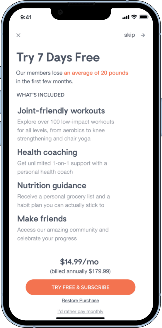
To the right, a redesigned payment wall that increased 58.2% conversion rates

To the right, a redesigned payment wall that increased 58.2% conversion rates

User Research

I qualitatively coded customer voices to make data-driven design decisions

I qualitatively coded customer voices to make data-driven design decisions

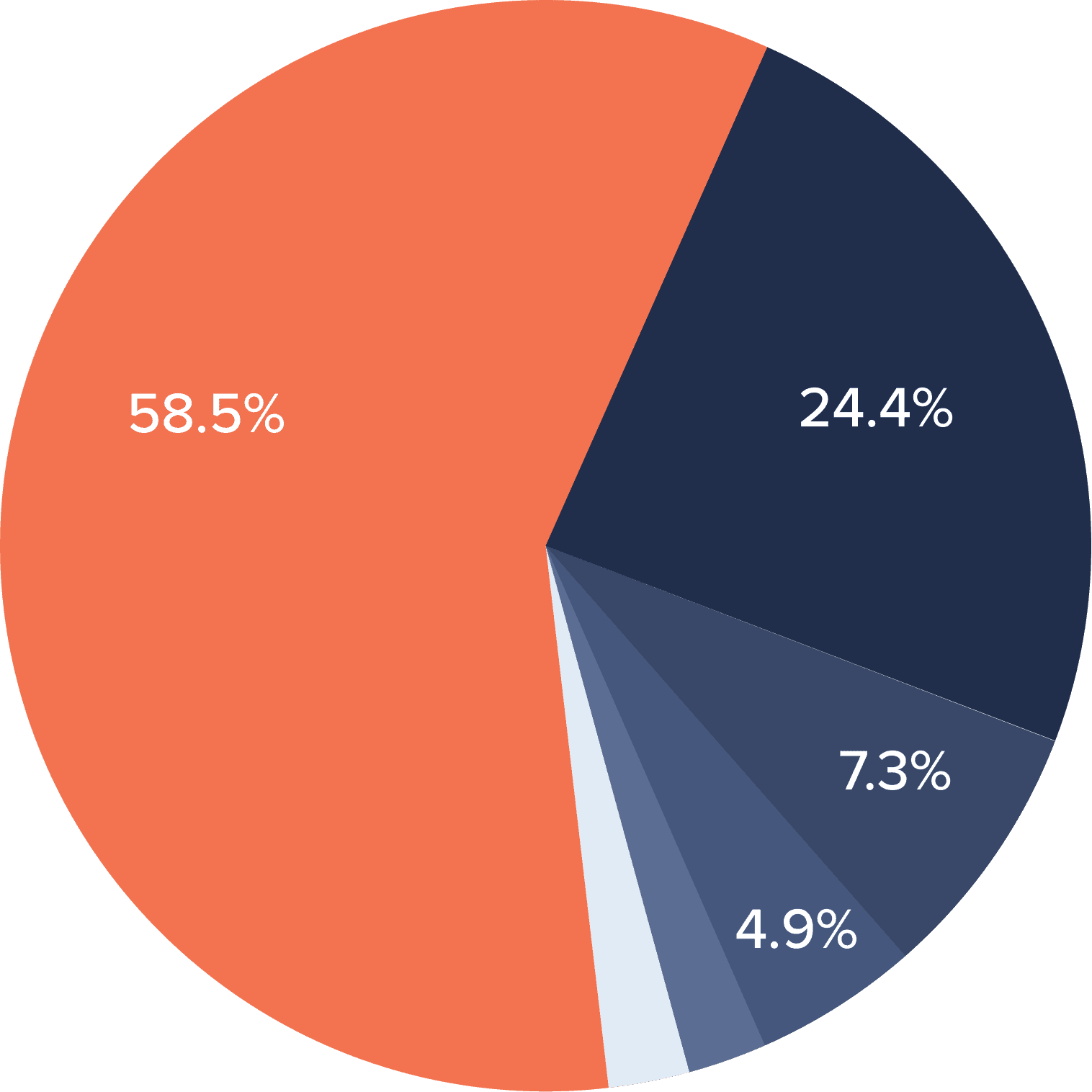
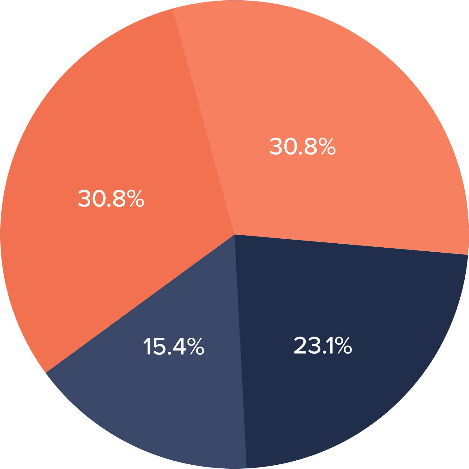
Instead of starting from a persona template, I started from primary sources: client spreadsheets, Facebook comments, and community messages from actual Mighty Health members. Qualitative coding of that material surfaced three quantified themes:

Instead of starting from a persona template, I started from primary sources: client spreadsheets, Facebook comments, and community messages from actual Mighty Health members. Qualitative coding of that material surfaced three quantified themes:

58.5% of users strongly prioritize weight loss

39.3% users goals are to improve overall health, with family & weight loss as key motivational factors
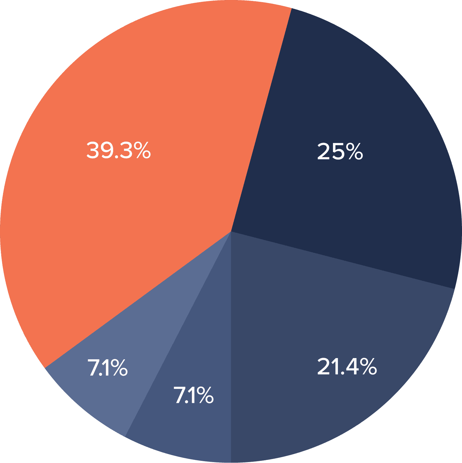
61.6% favored exercise and food programs, following with community and accountability

Research takeaway

There is a need for Community Engagement

There is a need for Community Engagement

The first two findings confirmed the product's positioning. The third was the lever: members weren't just buying programs, they were buying people who notice whether you show up. Community and accountability became the through-line for every design decision that followed. The persona I built ("Lily") was a communication artifact distilled from this data to align stakeholders, not a substitute .

The first two findings confirmed the product's positioning. The third was the lever: members weren't just buying programs, they were buying people who notice whether you show up. Community and accountability became the through-line for every design decision that followed. The persona I built ("Lily") was a communication artifact distilled from this data to align stakeholders, not a substitute .

Sprint 1

I redesigned the payment wall to make the annual plan an easier choice

I redesigned the payment wall to make the annual plan an easier choice

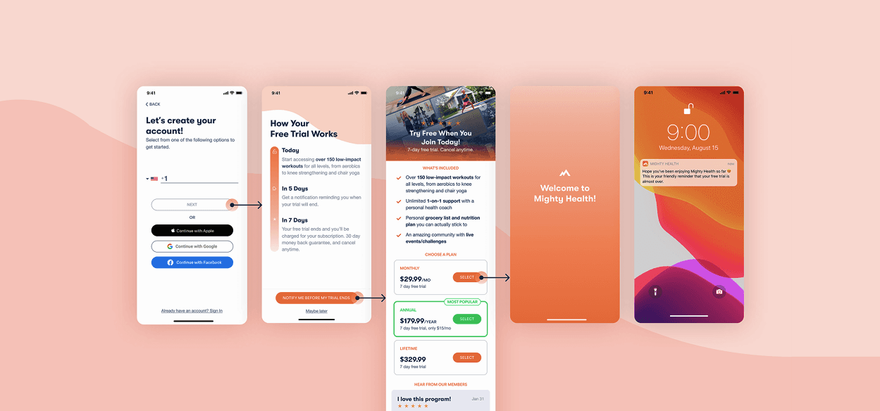
The payment wall is where interest converts to revenue, or doesn't. For users like Lily, the decision to subscribe isn't just financial; it's an act of trust in a product promising real change. The existing payment wall and FAQ made that trust hard to extend: plan value wasn't legible at a glance, and the FAQ density created cognitive load at exactly the wrong moment.

The payment wall is where interest converts to revenue, or doesn't. For users like Lily, the decision to subscribe isn't just financial; it's an act of trust in a product promising real change. The existing payment wall and FAQ made that trust hard to extend: plan value wasn't legible at a glance, and the FAQ density created cognitive load at exactly the wrong moment.

The payment wall is where interest converts to revenue, or doesn't. For users like Lily, the decision to subscribe isn't just financial; it's an act of trust in a product promising real change. The existing payment wall and FAQ made that trust hard to extend: plan value wasn't legible at a glance, and the FAQ density created cognitive load at exactly the wrong moment.

The payment wall is where interest converts to revenue, or doesn't. For users like Lily, the decision to subscribe isn't just financial; it's an act of trust in a product promising real change. The existing payment wall and FAQ made that trust hard to extend: plan value wasn't legible at a glance, and the FAQ density created cognitive load at exactly the wrong moment.

The key moves in the final design: restructured plan presentation so the annual value was legible immediately rather than buried in comparison text. I streamlined the FAQ to reduce density without losing coverage and brought the visual hierarchy in line with what users were already encountering in analogous apps.

The key moves in the final design: restructured plan presentation so the annual value was legible immediately rather than buried in comparison text. I streamlined the FAQ to reduce density without losing coverage and brought the visual hierarchy in line with what users were already encountering in analogous apps.

Slide 1
BACK
NEXT

The redesign improved trial conversions by 58.2%.

Sprint 2

Motion converts better than product shots

Motion converts better than product shots

The hero is the highest-leverage region of the landing page, and the company's previous tests had already established one fact: real photography out-converts illustration for this audience. My competitive analysis across comparable health products pointed one step further. The strongest competitors led with motion and social proof: program videos, member testimonials, faces in action.

The hero is the highest-leverage region of the landing page, and the company's previous tests had already established one fact: real photography out-converts illustration for this audience. My competitive analysis across comparable health products pointed one step further. The strongest competitors led with motion and social proof: program videos, member testimonials, faces in action.

Slide 1
BACK
NEXT

Video Focused Landing Page

Mobile Iterations Product Focused, Video Focused, & redesigns

Engineering couldn't support half my test. I re-scoped the experiment instead of shrinking the learning.

Midway through the sprint, developers confirmed they couldn't change the mobile version of the landing page within our timeline. Since I couldn't run the full test I'd planned, I shifted focus to a rigorous A/B test on desktop where the infrastructure already existed, and used two lower-traffic pages, Testimonials and Members, as a cheap, fast secondary testbed for hero imagery, recycling already-validated YouTube ad creative so no new content production was needed.
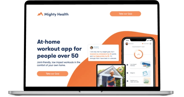
Testimonial Landing Page

I A/B tested other iterations and found the ‘Testimonial’ banner for YouTube increased conversion rates by 17%
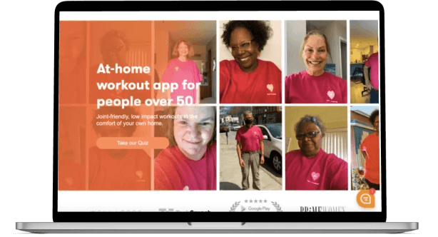
Members Landing Page

Using a video collage of MightyHealth users, aligning with our focus on interactive elements.

So the hypothesis: a fitness-video hero will out-convert a product-screenshot hero, because for users deciding whether this program is "for someone like me," seeing people like them moving is the answer to the question, and a static app screen isn't

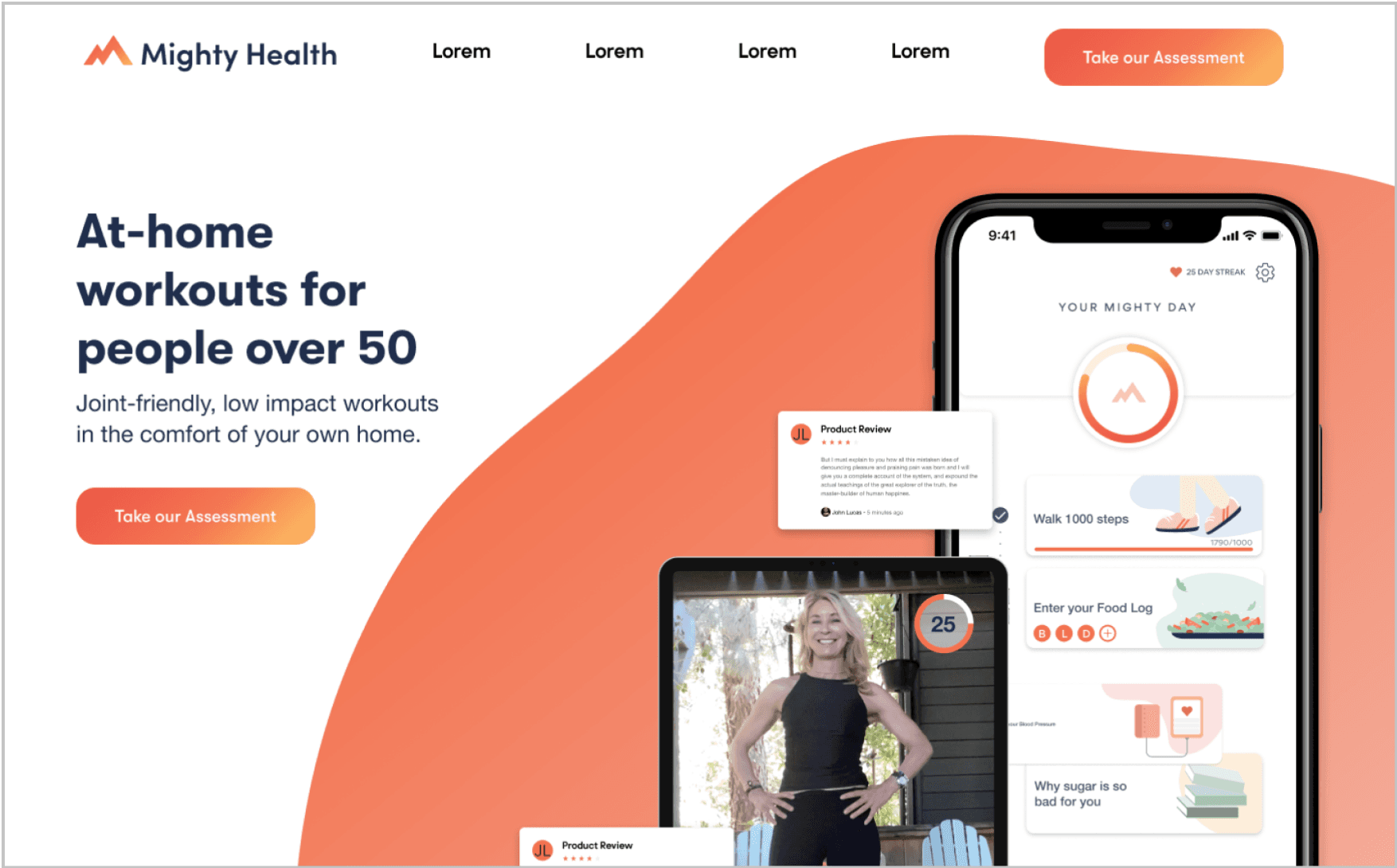
I designed both variants, product-focused and video-focused, for desktop and mobile, and prepared the test.

Redesign increased 95% confidence with 50% lift on click-through rates .

Redesign increased 95% confidence with 50% lift on click-through rates .

Results

58.2% more trial conversions, 50% more clicks on the landing page, 17% on the secondary test

58.2% more trial conversions, 50% more clicks on the landing page, 17% on the secondary test

1. Payment wall redesign: improved trial conversions by 58.2%.

  1. Desktop hero test: the fitness-video variant beat the product-focused control, reaching 95% confidence with a 50% lift in click-through rate.

  1. Testimonial page banner: the variant built from winning YouTube ad creative increased click-through rate by 17%.


Reflection

Business value is a design constraint, not a design compromise.

Business value is a design constraint, not a design compromise.

Two sprints taught me different things. The payment wall taught me that the moment of commitment deserves as much design attention as the top of the funnel. The landing page taught me something about evidence and constraints: when half my test surface disappeared, the design skill that mattered wasn't generating more options. It was re-scoping the experiment so the team still learned the most important thing on time. The other lesson was about primary data. Coding member messages produced findings that stakeholders can't argued with. I've led with primary data in every project since.

Two sprints taught me different things. The payment wall taught me that the moment of commitment deserves as much design attention as the top of the funnel. The landing page taught me something about evidence and constraints: when half my test surface disappeared, the design skill that mattered wasn't generating more options. It was re-scoping the experiment so the team still learned the most important thing on time. The other lesson was about primary data. Coding member messages produced findings that stakeholders can't argued with. I've led with primary data in every project since.

.say hello

Thanks for checking out my portfolio! Feel free to connect 👋