Call of Duty's Battle Pass competitive analysis
Helping define the next battle pass from benchmarking competitor systems
Summer 2025 (12 weeks)
UX Design Intern
Microsoft Suite · Copilot · Figma
Synthesis & framework-building · Stakeholder alignment
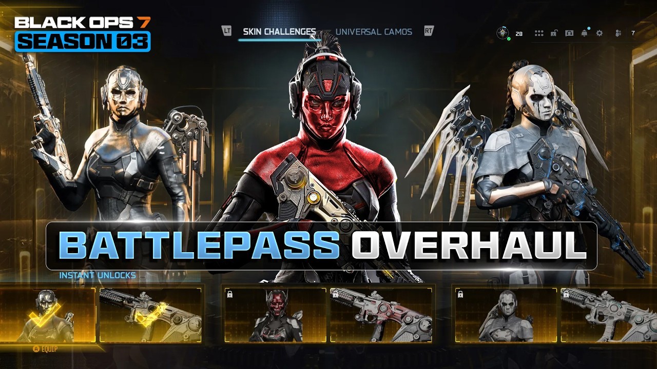
Context
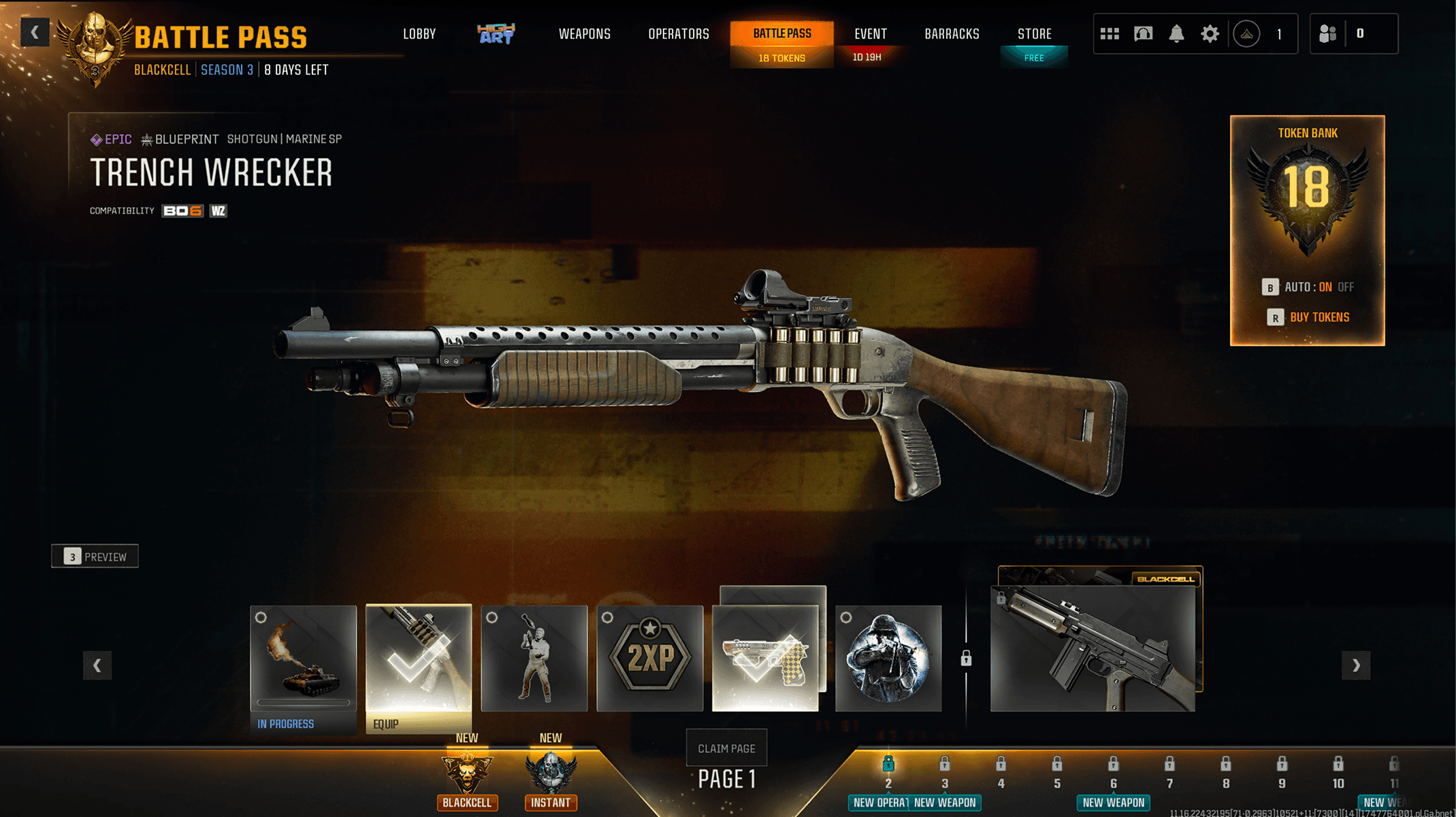
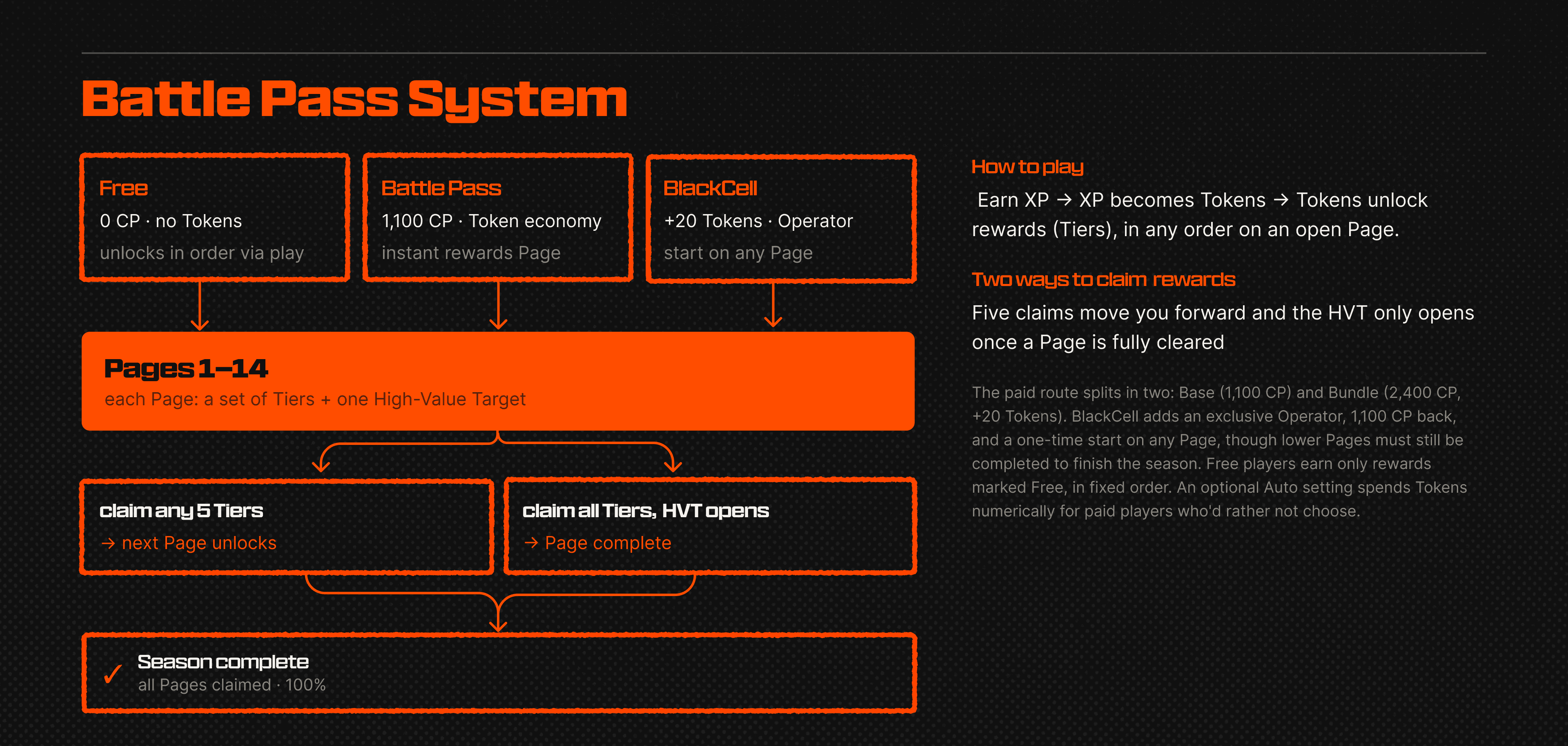
Overview
Problem

Without a shared UX framework for comparing progression systems across games, discussions around improvements could easily become subjective or fragmented.
A framework before critique

Breaking it down

What I found
1. Visibility, not generosity, drives momentum.
The passes that felt best weren't the most generous, they were the most legible. Clear XP bars, high-contrast "ready to claim" cues, and forward pagination consistently created momentum, while disconnected progress signals and the absence of a persistent overview made long-term planning harder than it should be.
2. Small status decisions create outsized confusion.
The claim-and-equip flow was a recurring offender. When unlocking, claiming, and equipping are split across too many card states or ambiguous side-by-side buttons, players think they've done something they haven't. The cleanest flows collapsed those steps and used strong visual confirmation, so an item was unmistakably yours.
3. Challenges only motivate when they live in the moment.
The strongest systems wove missions into moment-to-moment play and the post-match recap, so progress felt connected to the action. Where challenges sat off in a separate menu, they did far less to drive engagement.
4. A great reward is wasted if players can't find the preview.
Reward previews are where excitement gets manufactured. Low-contrast or easily-missed entry points meant players never saw the items meant to pull them forward, while the best examples made previews prominent and let the reward sell itself.
From findings to recommendations
Reflection


